Spatial layers
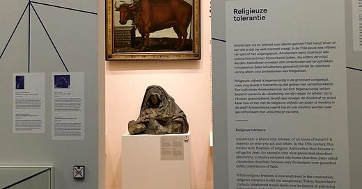
Last week I visited the newly (re)opened Amsterdam Museum (in its temporary location at the Hermitage Museum). This space shows the history of the city through a selection of objects organized chronologically. The objects are distributed as a collage, horizontal but also vertical (which can be seen from a central platform in a second level). Thanks to the variety of object formats the tour seemed to me rhythmic and dynamic.
Regarding the design of the exhibition, I particularly liked two aspects. First of all, the exhibition panels are written in Dutch but also in English, and it is easy to identify each language because the typography used is different (a very designer fetish, I know). The second aspect is a data visualization system created with a set of poles, where the year is seen on one side and the population on the other, helping to understand how events caused the population to change over time.
But the space that I liked the most is the internal structure placed in the center of the gallery. This structure offers a different curatorial approach than the outer walls. Walking through the “outside”, the corridor is a journey through the history of the city, while the interior structure illuminates themes that give depth to Amsterdam’s living history. The internal space uses openings and visual markers to overlay these extra content on top of the established story told on the outer walls of the gallery.
This internal space helps make the stories part of the city’s history, making them more tangible and encouraging dialogue. This space will change over time, as it is flexible and can be updated with current themes as they appear.
I think it is a practical example of success in which design and curation go hand in hand, to create what a museum should be: a polyphonic and debate space. Very inspiring, really.


